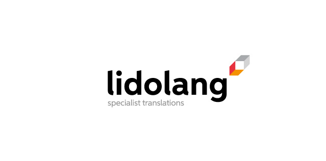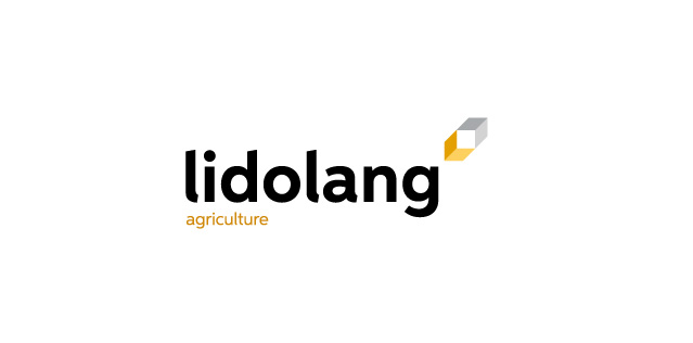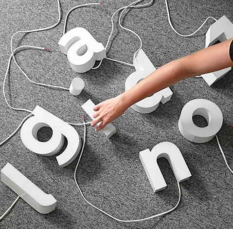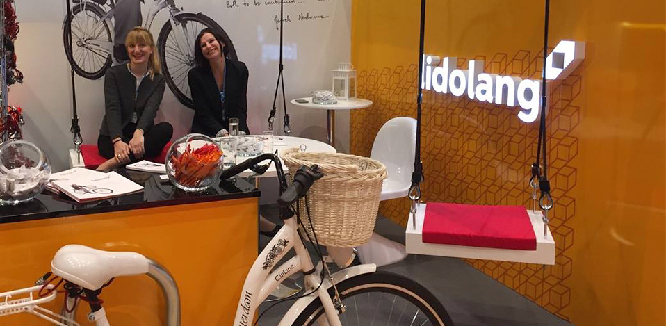
Lidolang
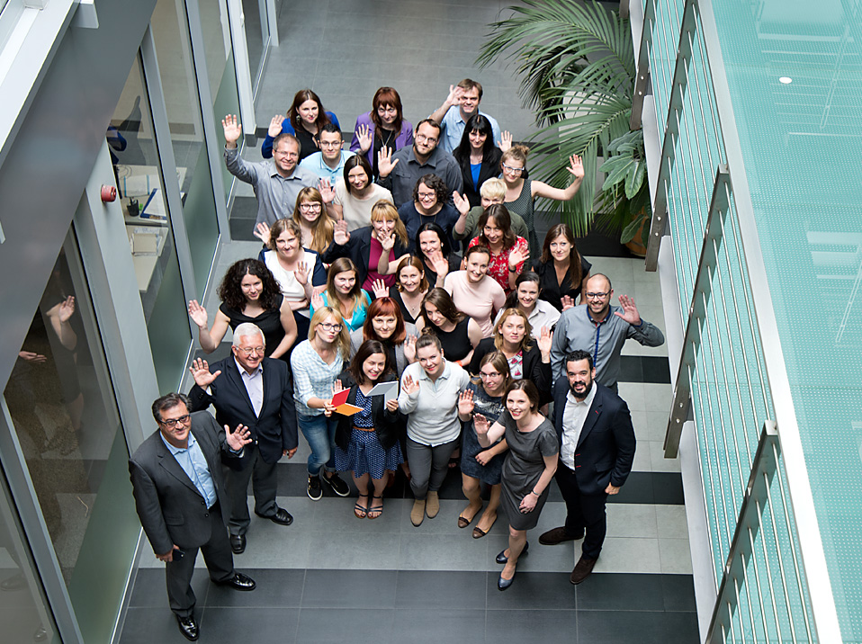
A great team of passionate people, this solid company has existed for over 24 years and has many years of experience in cooperation with the best suppliers. Thanks to its, well-qualified employees, and rich technological supply network, lidolang is deemed one of the best translation firms in Europe.
About the project
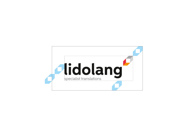
After our rebranding, lidolang became part of Seprotec Multiligual Solutions Group, scoring as one of the 30 best language service agencies in the world (rating by Common Sense Advisory, 2016).
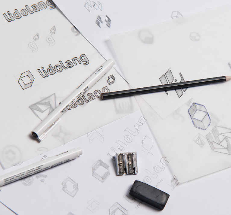
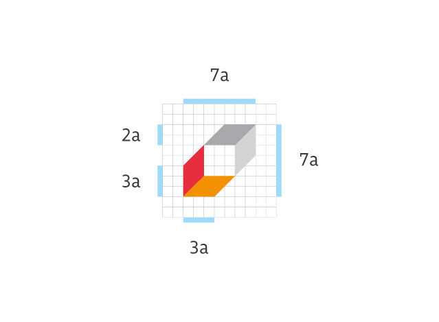
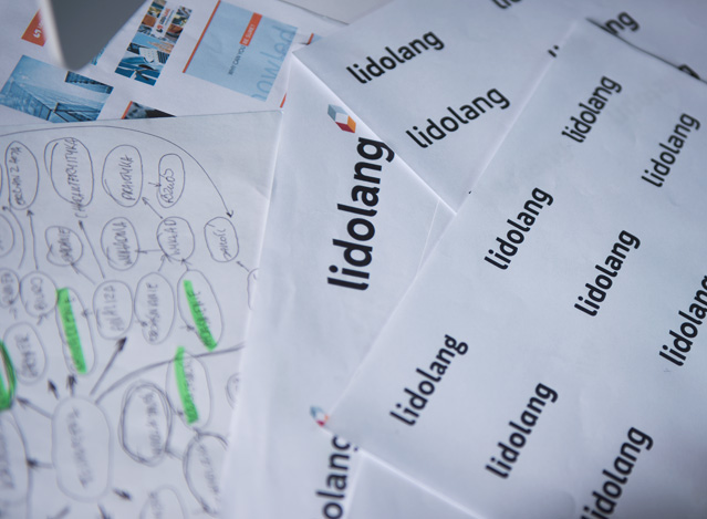
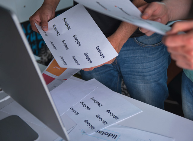
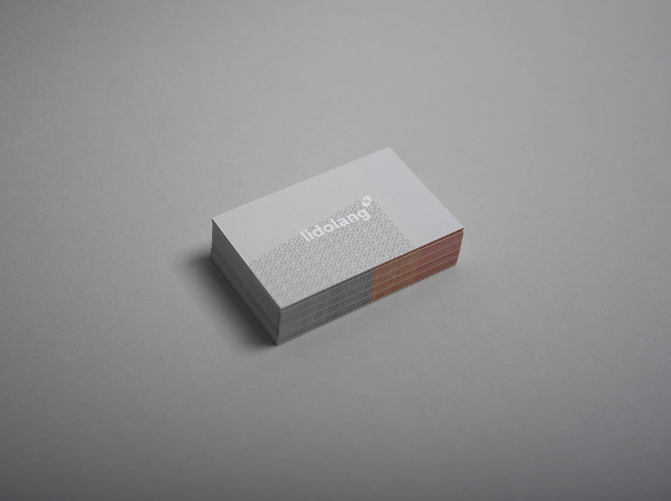
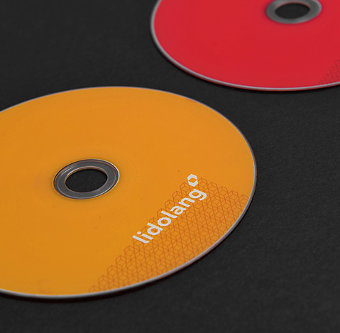
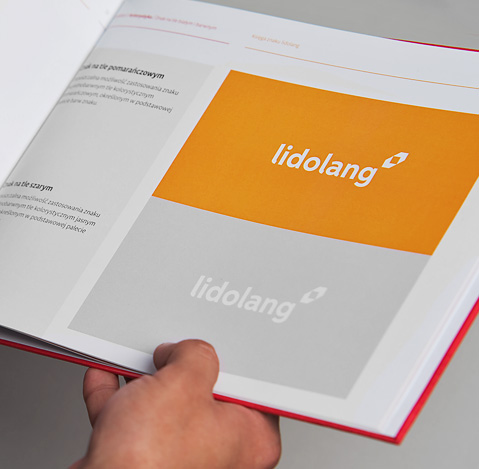
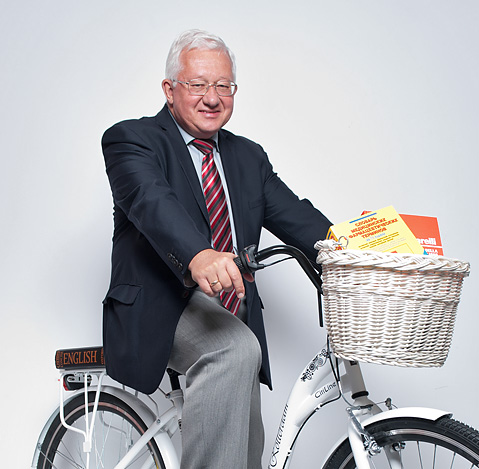
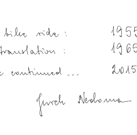
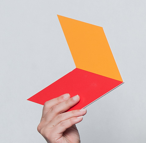
It was our task to conduct rebranding of one of the best translation firms in Europe. We started from detailed analysis and investigation of the sector the company represents. We outlined the brand strategy and implemented new brand identity. Bearing in mind company’s long, 60-year tradition and its recognizability, we decided to transform the existic sign, rather than replace it altogether.
The implementation process was very vast and was completed in February 2016. During this process, our work for lidolang has given us lots of pleasure.
Scope
Copywriting
Rebranding
Brand strategy
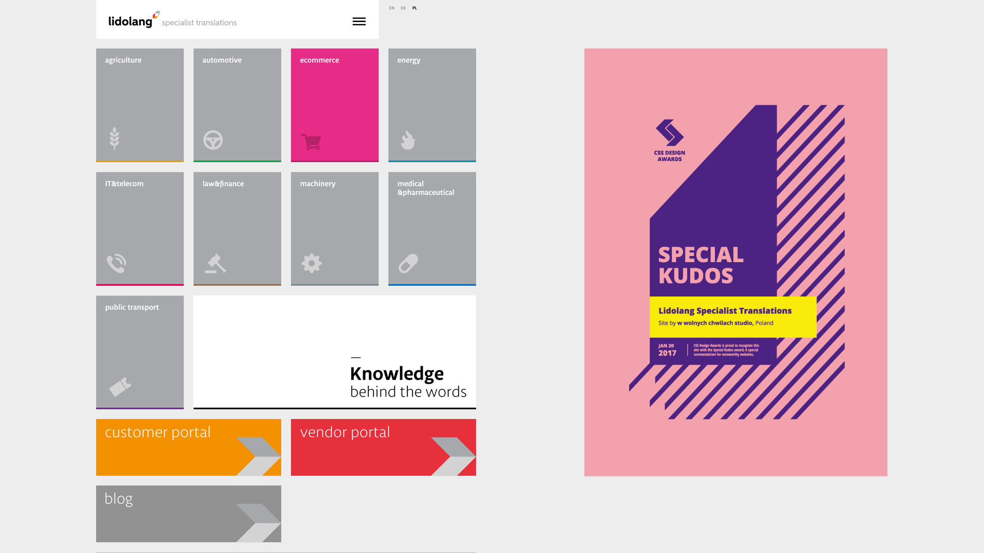
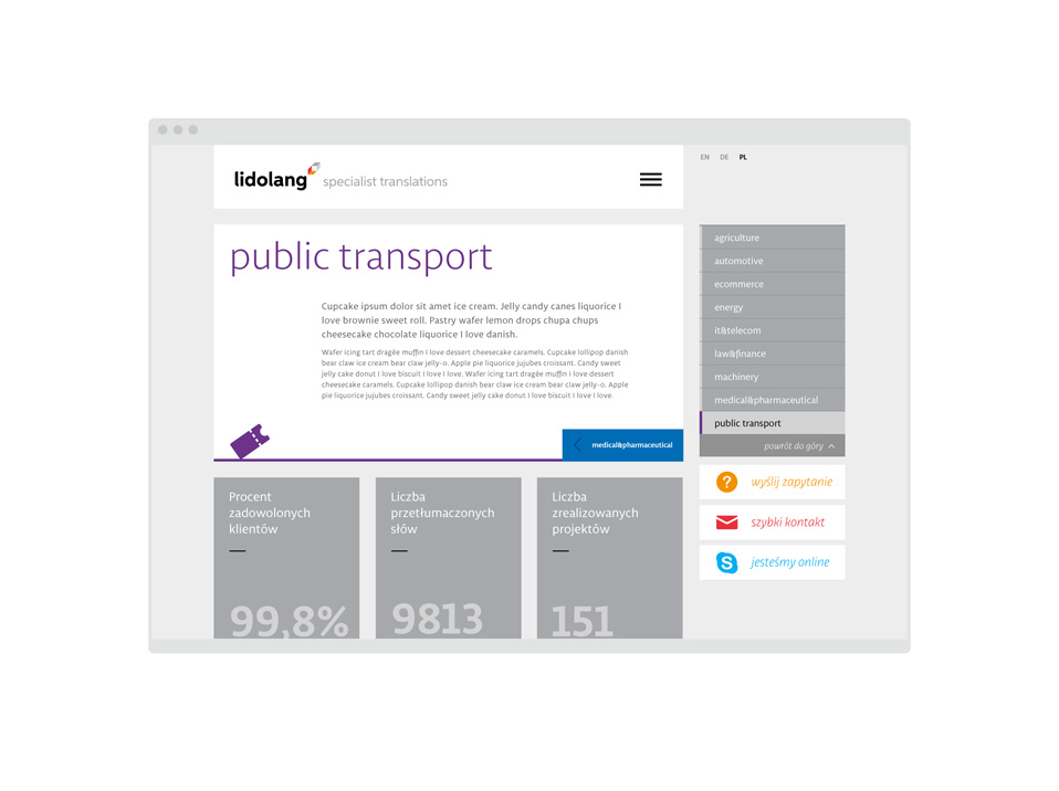
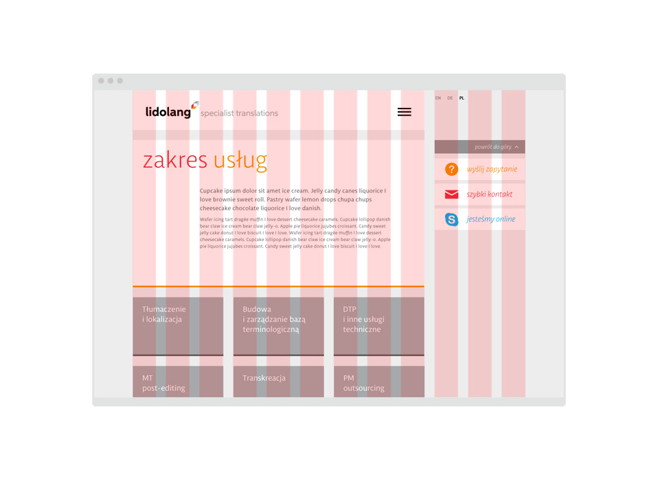
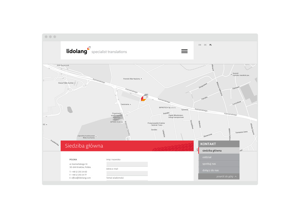
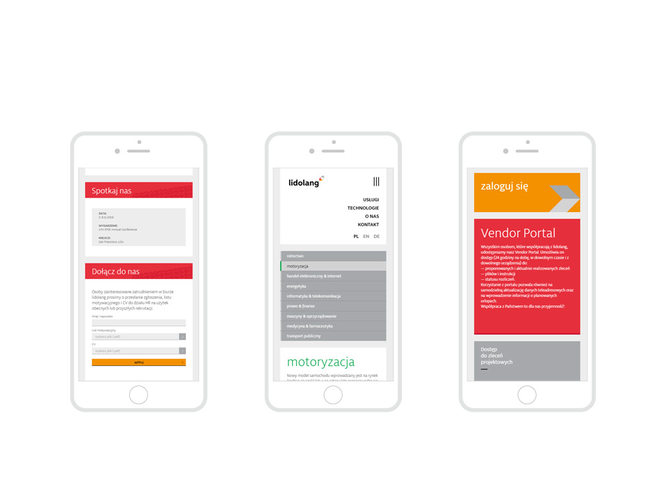
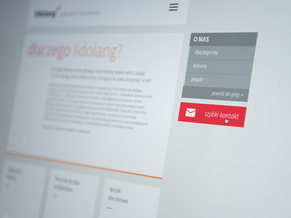
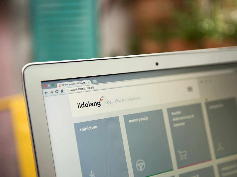
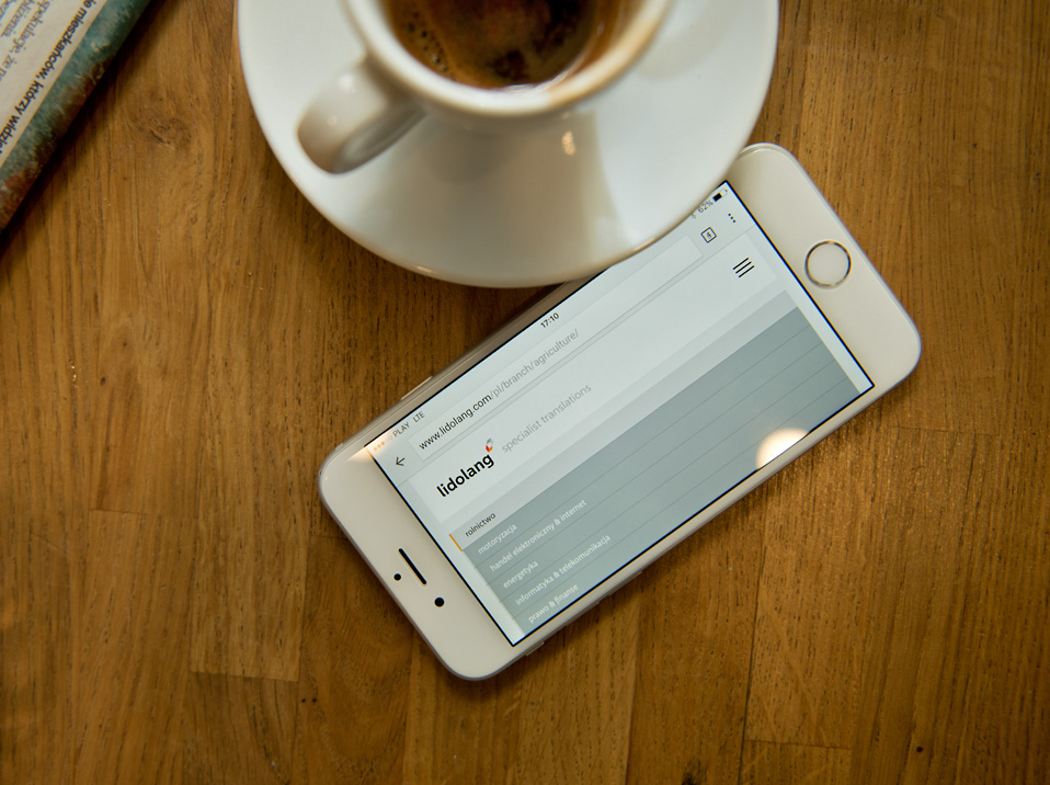
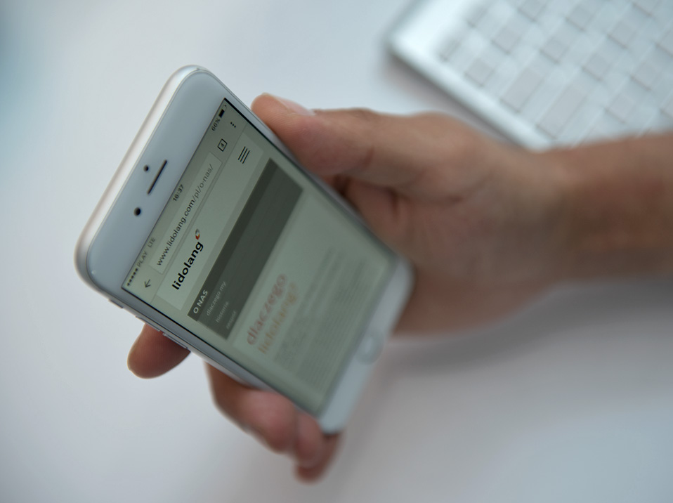
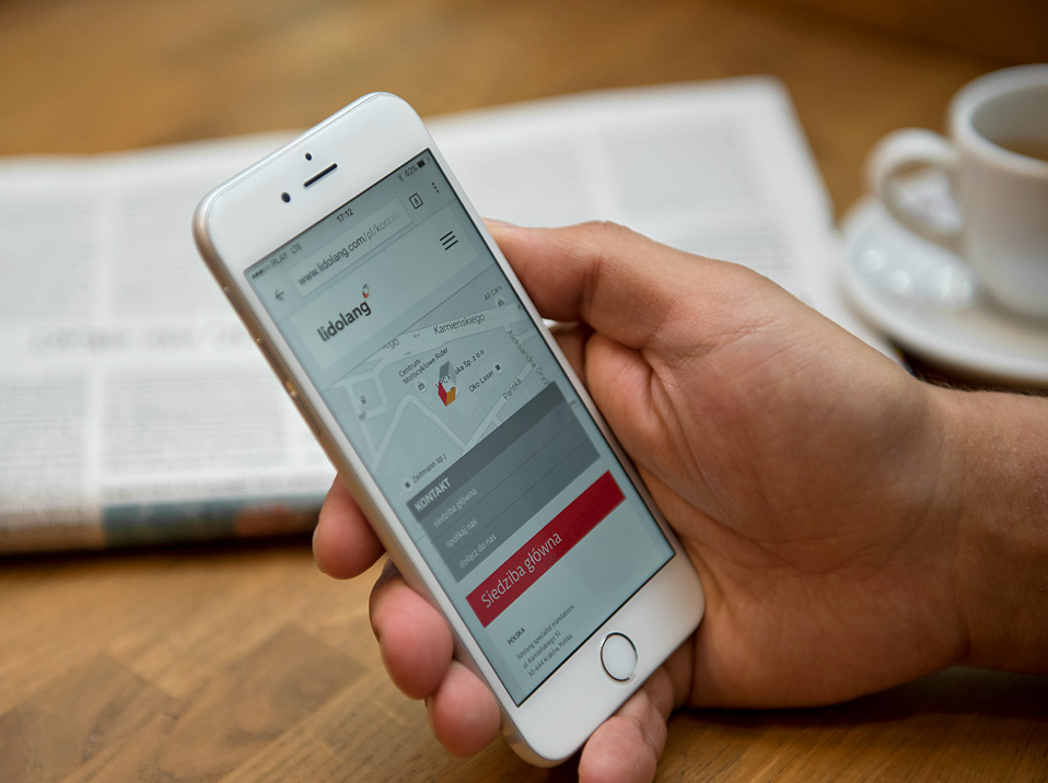
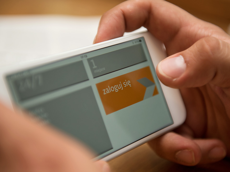
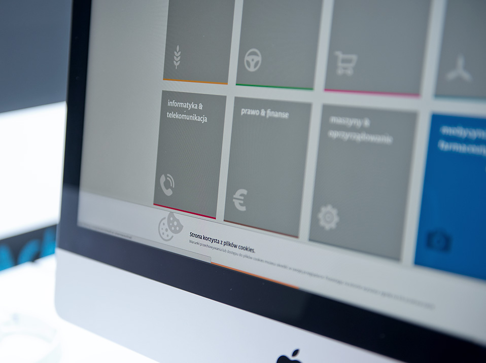
Wireframes, UI/UX
Web design & development
POS
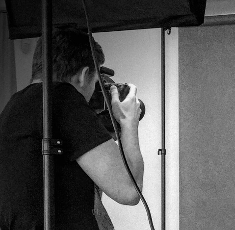
Photo shoots
3D visualizations
Visual merchandising
Team
Marta Harasym
Adam Harasym
Józef Kieraś
Mateusz Gumula
Patryk Dobrowolski
Filip Gonciarczyk
Rafał Kalfas