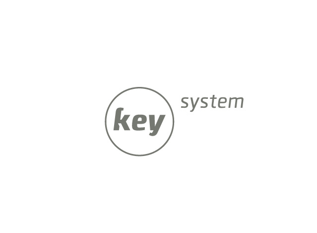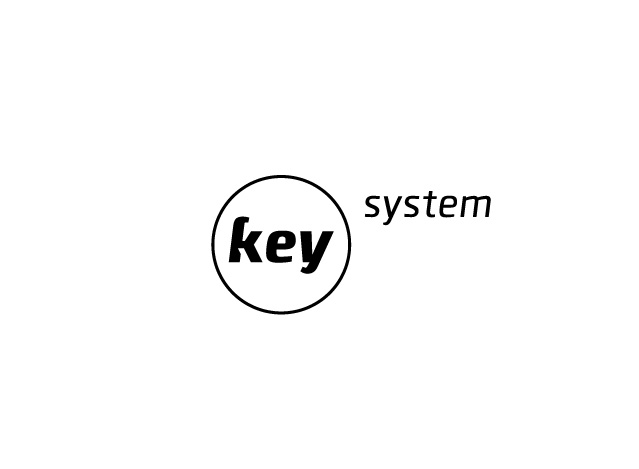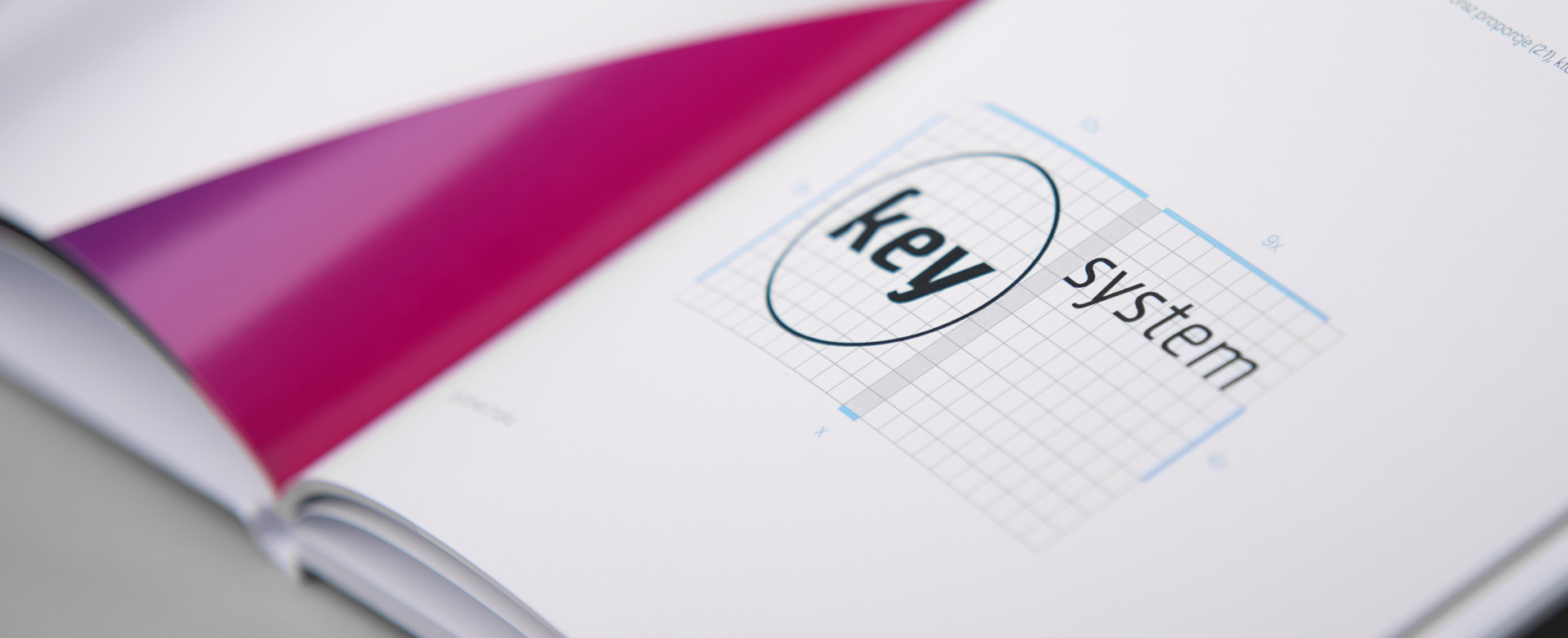
Key system
Love and passion for all that’s intelligent. They will easily upgrade the comfort of your living in just one click. Surely, they are absolute experts at building automation and using a smartphone from any place in the world they can turn off the light, lock garage gate or turn on heating. We love such challenges and we love to surprise our clients.
About the project
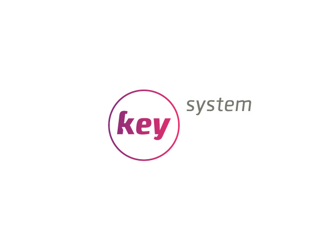
Asia and Kuba came to us after many unsuccesfull attempts at finding favorite graphic form for their logo. They brought us many unsatisfactory designs of their company’s unfinished logo. Analysing those materials, we decided to highlight the first part of the name — KEY, so we positioned it to the front. We also added a strong color accent and finally put the logo into a circle. Unbelievable as it seems, during all that time we had no idea Kuba had excluded circle as the main shape of their sign but all changed once he saw our drafts. That must have been the bulls eye as the logo got approved without any ammendments.
Scope
Copywriting
Logo
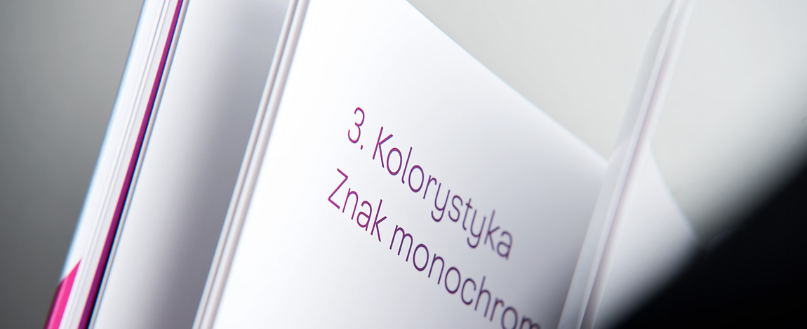
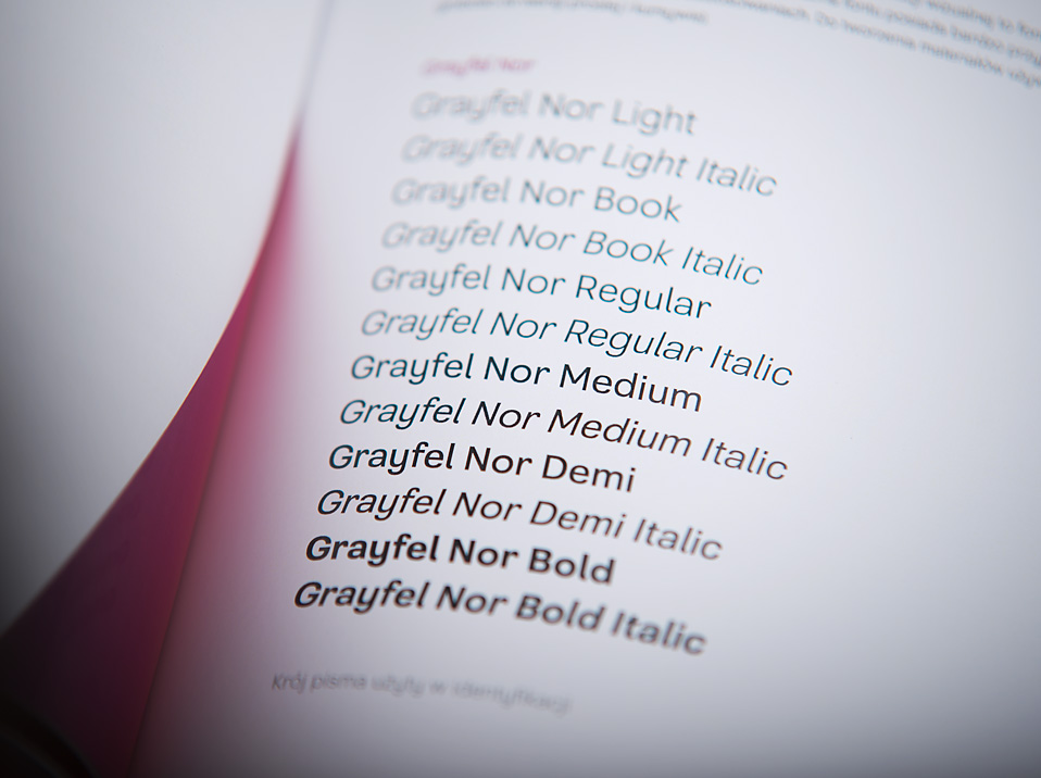
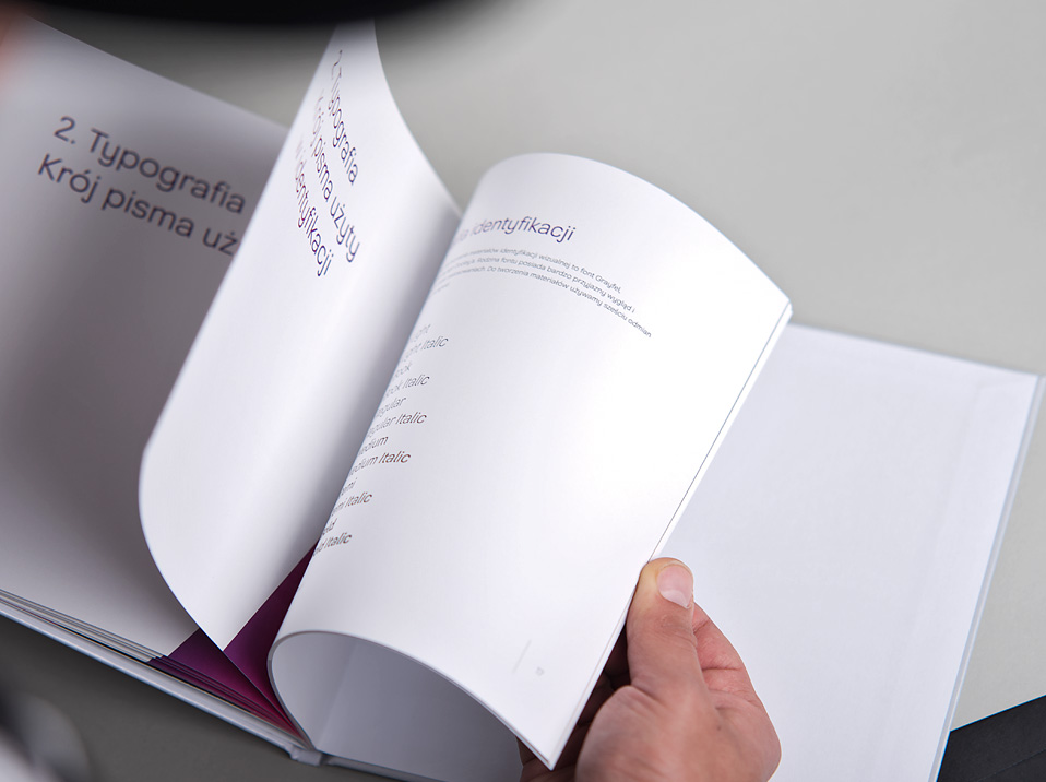
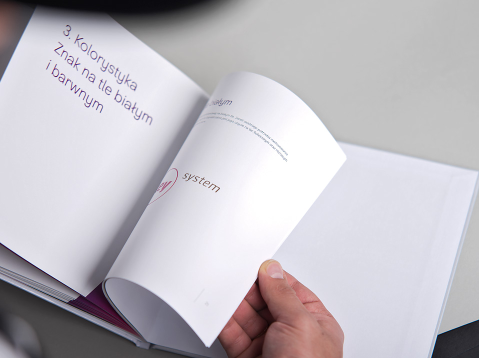
Brand identity
POS
Animations
Team
Aleksandra Gumula
Józef Kieraś
Mateusz Gumula
Adam Harasym
Rafał Kalfas